
Short Video Feature
Short video feature and home screen redesign that led to a 730% growth in the average monthly sales of the product.
My Role
I was a contract UX Designer with the following responsibilities:
Competitor Research
High Fidelity Screens
Design Hand-Off
Iterations
Product Category
Social
E-Commerce
Multimedia
Design Service
iOS
Android
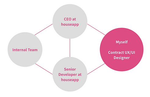
Team structure of the project
Design Applications
Figma
Zeplin
Timeline
March 2021
(2.5 weeks for high fidelity)
Background
The client decided to add video features to their existing platform, to attract quality content creators and users.
Context & Business Goals

houseapp is a Korean application that is a social + e-commerce + design service for home interior design. The client decided to add video features to their existing platform, to attract quality content creators and users. And to eventually enhance the sales of the product that will be tagged to the content. I was on board with the project to design high-fidelity screens of the video feature release.
There were 3 business goals:
-
Redesign their home screen to expose video content and let quality content creators featured.
-
Design the video content feature , similar to Tiktok, to induce the tagged product sale through the content.
-
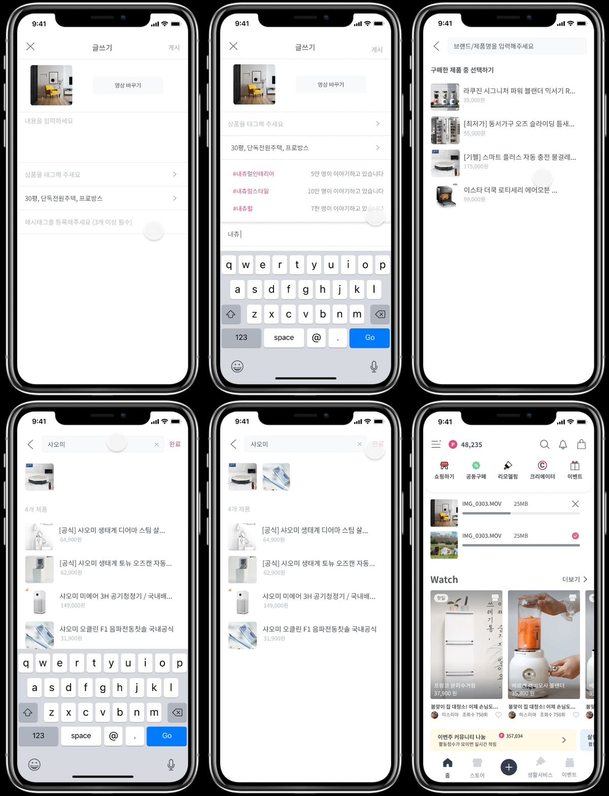
Design the video upload, which should be an easy process for users to add contents and product tags.
Constraints
The client had to ship the product in a month for a meeting with stockholders. That’s why I only had 2.5 weeks for the entire design process. Thus this project does not include any user testing and extensive research that I would normally go through.
However, the client mentioned that they are planning to take further investigation and update the feature based on the KPI after release to the market.
Work Process
Since this was a fast pace project with 2.5 weeks timeline, I worked directly with houseapp’s CEO and senior developer to get instant feedback on business development and feasibility. We mainly communicated through direct messages and Figma comments for a fast turnaround.

How I worked with the team
Research
Finding familiar UX patterns for users, from the live commerce and social competitors
Competitor Research
The target user for houseapp is females in the ages of the 30s and 40s. The client mentioned that the user group prefers familiarized UX patterns, especially when they do shopping through the app.
So I studied a few live commerce & social competitors to get a sense of frequently used patterns. Below are some useful patterns I learned through the research:
Displaying the featured product
NAVER live commerce showed thumbnails of featured products on the video screen. When users click the thumbnail, it directs users to the full list of products.

Use of interaction with a clear intention
Below are Instagram’s transitions from the video to the tagged product vs. comments.
As you can see, the transition to the product diminish the video screen while the comment transition doesn’t make the video shrink. This shows what to focus, based on the user flow.


User Flow
To eventually enhance the sales of the product that will be tagged to the content.
Wireframes
I created wireframes of 3 user flows that the client has given to me.
High Fidelity
How might we help users engage well with each other?
Key Screens & Iterations
Home screen - how might we promote new features to users effectively? / how might we help users engage well with each other?
I considered the following when designing the home screen;
1. Emphasizing the point users earned.
houseapp has a point system that users can use as cash in their marketplace. Users earn the point by writing a post or when other users buy products through the tag they have added. However, the client found that not many users are aware of the point system.
2. Placing the recommended videos in the primary location to promote the new feature.
3. Featuring the recommended creators to motivate users to be more active on the platform.
Below are the evolutions of the home screen;

The top bar's point status became simpler
Video watchlist located at the top, separated from other feeds
The filter and the feeds grouped together and relocated to the bottom
Banners had added to promote any weekly special related to the extra point
Watch video - how might we display different layers of information on the full-screen video?
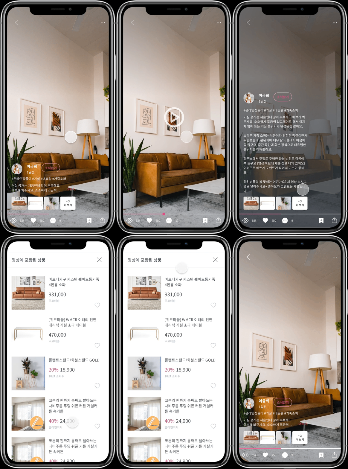
Several UI elements are essential in the video screen;
-
Thumbnails of the tagged product
-
User profile
-
Description
-
Video control bar
The default video is in full-screen format, so all the information we want to display is on the way to watch the video. So I developed several steps to reveal the information. Below shows how users would interact with different levels of information: Hide Description, Default, and Expanded Information.
Upload video - how might we minimize the upload process?
Through the process, I evolve the flow to make uploading simple. Below shows the process of adding hashtags and product tags.
Design Hand-Off
Set up the rules and communicated through the annotations
Set up the rules
Since I hand the design off to developers, I clarified a few areas where I got questions from them. Below are a few examples;
Thumbnail sizing for horizontal vs. vertical scroll contents
For the contents that were displayed in the horizontal scroll, the thumbnail size and the distance stay the same whether the screen is in 360 or 375 px.

Horizontal scroll contents in 360 vs. 375 px
However, if thumbnails arranged in a two-column view, the width of the thumbnail grows depends on the size of the screen. The distance between the elements stays the same.
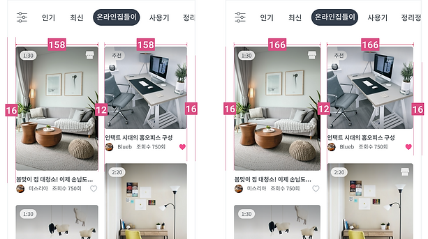
Vertical scroll contents in 360 vs. 375 px
Annotations for the possible clicks and interactions within the screen

Achievements
Working in a fast-paced startup environment
By working with houseapp, I learned how to work in a fast-paced environment by using Figma and direct messages. It was also a great opportunity to work directly with the CEO and senior developer of the team, so I know the business goal and technical feasibility clearly in mind. Overall, this project teaches me how to work around different work environments and constraints.
Key Achievements
houseapp launched the feature in June 2021. The video feature helped the company grow significantly. Below is some data since the feature was released:
-
Within 3 months of implementation, monthly active users increased by 30%
-
Reached 4 million app-downloaded users by November 2021.
-
Average monthly sales increased by 730%.
-
Reached 10 million combined views within 5 months

Image by houseapp
